In large projects, or in projects that span across months or years, it’s common to start to loose track of z-indexes.
What usually happens is that you start using z-index which are commonsensical (1, 2, 3) but one day you start forget where they are and their values. That is the point when, just to be sure it is on top of everything else, you set an element to 100. After a few months (or when someone else works on you code) the same issue happen again and the next z-index to another high number. And then the z-index war starts.
But it doesn’t need to be this way, there are strategies to avoid the conflict. Let’s see a practical example of the issue before we dive into the solution:
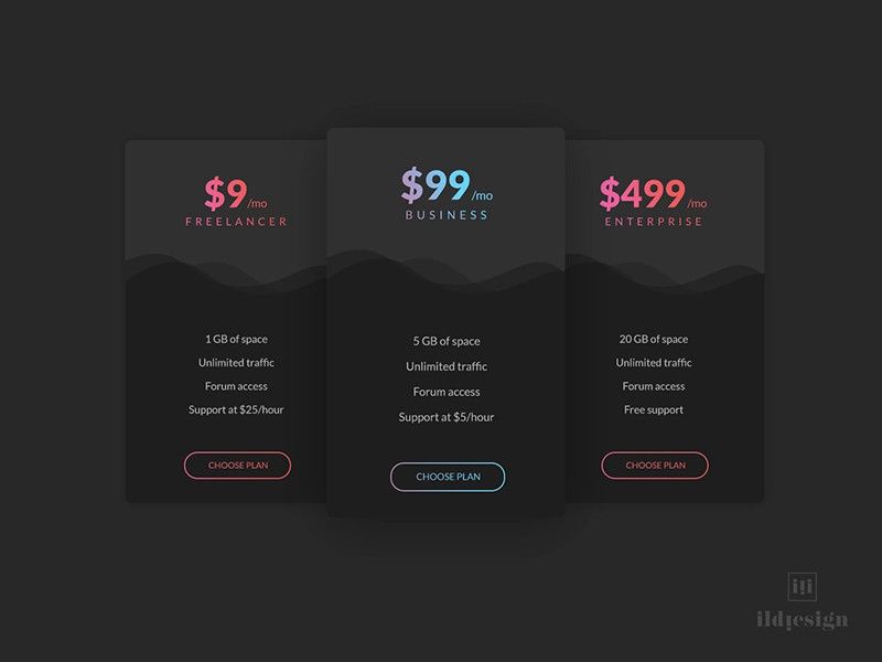
In the past I built a few websites for companies and local businesses and a lot of time I had to build components that displayed the different pricing tiers.
Something like this one:

Let’s assume the website had a sticky navigation bar on the top of the screen with the company logo and the links to different pages (yes, yes, old school, I know!)
You start to build this UI, you code the three cards displaying the different pricing models. The you set a z-index to the central card in order to overlap the other two.
All works fine, until you scroll to the top. Once the three cards reach the navigation bar, the cards two cards on the sides slide underneath the navbar, but the card in the middle slides above the navbar (we have all been there, in a way or another).
This happen because the the entire page is one massive stacking context and in the past a z-index slightly lower than what we added to the card was set for the navigation bar.
What a mess, right?
Yes, but it doesn’t need to be this way. We could create a new stacking context for the pricing component that we just created and we isolate it from the rest of the page.
There are two ways to create a staking context. One way is to add position and z-index to a wrapped around the pricing ui.
.pricing-wrapper {
  position: relative;
  z-index: 1;
}
This two properties together will create a new staking context, flattening the pricing component. Inside the pricing wrapper we’ll still have the a z-index hierarchy, but the outside world will see it as a single element (from the stacking prospective).
In this way, if the navigation bar had z-index: 100 and our component is set to z-index: 1, will slide underneath the navigation bar, even if our central card has z-index: 100 or more.
There is also a much nicer way to create a staking context and it can be done with a single css property:
.card {
  isolation: isolate;
}
The isolation property has a single specific purpose: creates a stacking context.
It will flatten the component as we describe before, but without the need to add a z-index on the parent. I’m not sure when the isolation property was added to css, however it started to became popular fairly recently. I think I started see the property popping up around 2020 and I ignored it for a while.
However, nowadays I’m using it pretty often, in particular in components that I know will be reused multiple times inside an application. Setting the isolation property allows me to have the piece of mind that the hierarchy I set inside it will be ignored by the rest of the codebase.
Until the next time, keep on coding!